Lexically - Vocabulary App
CHALLENGE: Empower people to learn new vocabulary through creating a Vocabulary Flashcard App.
Project Type
Individual Project
CareerFoundry
Deliverables
User Interviews - User Research
Usability Testing
Lo-Fi & High-Fi Prototyping
Tools
Figma
Marvel
Duration
2 weeks
PROBLEM
The majority of vocabulary flashcard apps available in the market are stagnant and follow a fixed curriculum. Numerous features are inaccessible via paywall, and some of these features are not even relevant to the core purpose of a vocabulary app.
SOLUTION
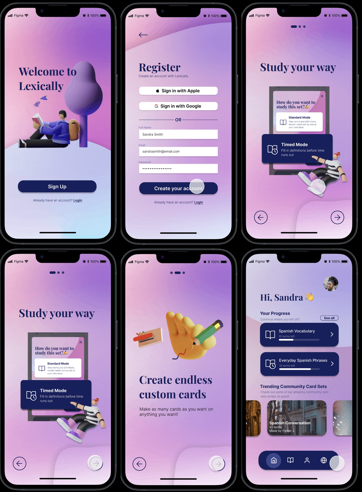
Creating a user-friendly vocabulary flashcard app that keeps things simple yet effective. Users receive timely reminders, track their progress over time, and personalize vocabulary lists.
EMPATHIZE - RESEARCH
User Interviews
I conducted a series of User Interviews via Zoom in order to gain insight as to how individuals currently utilize tools or resources to help them learn new vocabulary.
Methodology:
3 interviews done with different participants all in varying ages and backgrounds, all of them were engaged in some form of learning new vocabulary through pre existing apps, such as DuoLingo.
Goals:
What methods do current users of these apps go about learning new languages?
What keeps users engaged (their motivation) with these learning apps?
How often are they using their mobile devices to exclusively learn new vocabulary words?
What makes it easier for users to learn? (their environment, the method)
Learners have no time because they lead already busy lives
All participants felt that utilizing apps on their phone was a convenient way to do something productive whilst not having to worry about consuming time.
Talking to others makes them accountable for their learning
The participants use other friends/colleagues as a part of their motivation to learn. Two participants say they talk to other people in order to practice their vocabulary consistently, and it helps them with their accountability as well.
Consistency is key to learning
“I believe that consistent learning is the best way for me, my biggest motivation is practicing with my friend.”
“I easily forget words if I don’t use them or practice them daily. Streaks help me with motivation.”
Users are more inclined to use a vocabulary flashcard app if there is a customizable & engaging element to it
Insights gained from doing a competitive audit for similar vocabulary flashcard apps:
Imagery and simple UI are the strong points of each of these competitors
Vocabulary Builder, Word of the Day and the well-known DuoLingo all use progress trackers in order to motivate the users to consistently come back onto the app and make progress on the vocabulary lists that they are learning
In addition, a common pain point a lot of these apps have are that there are limited lists to choose from
An opportunity to come from this is the ability for users to create lists and curate their own study card decks
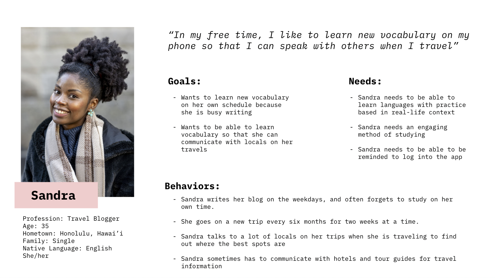
Meet my persona Sandra, a busy blogger based off of my user research
From the initial research, I was able to curate a persona that embodied the target audience that would potentially use my app to learn a new language for five to ten minutes out of her day on the go - with contextual and engaging elements.
How might we design a simple mobile app that allows Sandra to be motivated to learn new vocabulary?
DEFINE & IDEATE
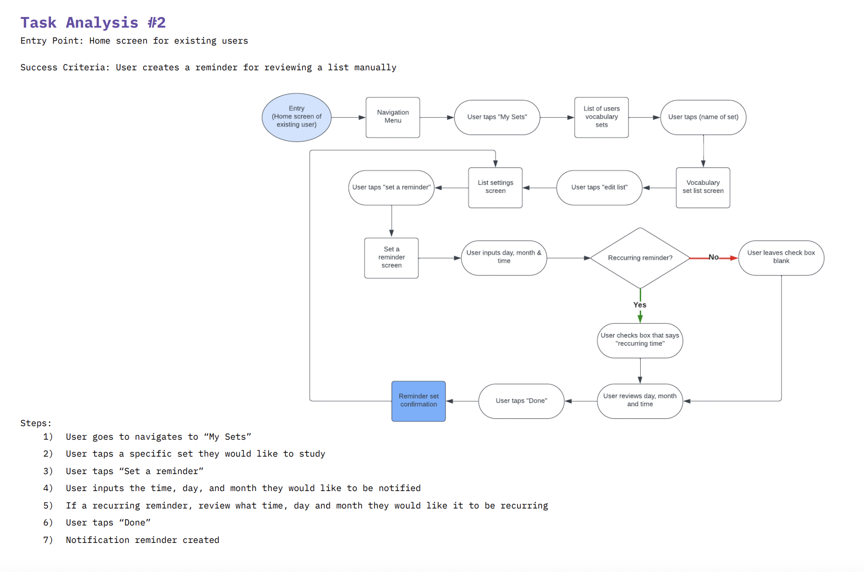
Creating User Task Flows
Now that I’ve created a target audience for my potential Vocabulary App, I tried to envision in what context would Sandra, my persona use my app on a day to day basis. I came up with two primary task flows that Sandra would use based on the research done about how to keep users motivated:
1) Signing up and making her first vocabulary list set
2) Setting up notifications through the app so that she is encouraged to come back to finish her lists
DESIGN SOLUTIONS & PROTOTYPING
Lo-fi Wireframes
From the tasks analysis I was able to create sketched low fidelity wireframes that would help me ideate through mock user interfaces quickly.
Usability Testing
I created an early stage prototype through Marvel, and user tested it among three participants. Below is the report in which I observed how participants navigated through my prototype and the opportunities for improvement of UX particularly in the flashcard portion of the app.
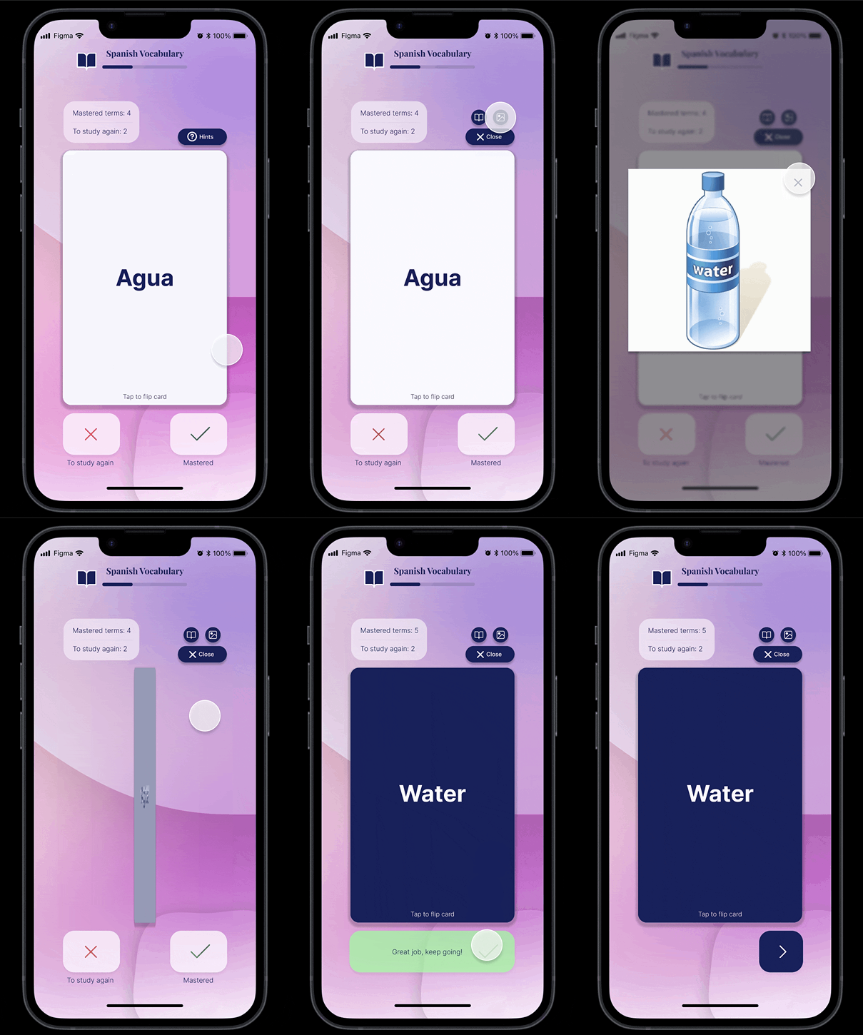
I created revisions of the flashcard UI based on the feedback of the participants. I needed to create a design that provided more clarity and direction (what constitutes as correct and wrong) for users when they went through each of the cards to study their lists. I created a score count to encourage progress through each of the lists, as well as offered hints- something that other competing Vocabulary Lists didn’t provide for users. This provided self-paced learning for users, allowing them to feel no pressure when completing the lists. Perfect for Sandra, who only has 5 to 10 minutes to spend on the app at a time.
Solution: Clear call to action buttons and a simple UI design
In Figma, I created a hi-fi prototype of the changes made to the flashcard UI based on the user feedback I had received. I removed the idea of having two colored arrows, and instead used labelled CTA buttons for “mastered” words and “to study again” words. This way, there would be a clear distinction between the two and reflect the progress for each term in the counter.
Reflection & Next Steps
-
Usability Testing
Due to the nature of this project & personal circumstances I was unable to have access to usability testing, so in my next phases, I would like to create prototypes in order to confirm my user flow chart.
Then with that information, I would be able to make changes to the high fidelity prototype in order to make the website more suitable for launch.
-
Feature Implementation
If given more time, I would like to explore and expand on community based features for the app along with a more fleshed out prototype for users to test.
ACCESSIBLITY (A11y)
I would also like to explore the option of implementing accessibility features on the website such as UserWay in order to make the site more equitable.


